


")
")
")
")
Domorela's Blog: Basic features in Graphs View
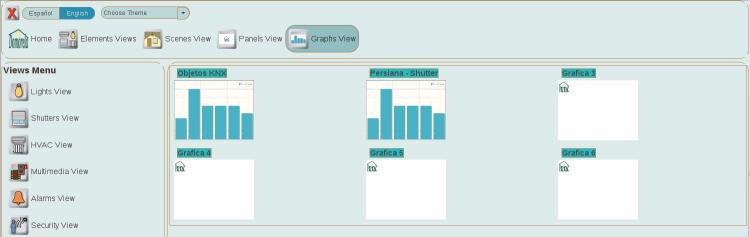
Domorela's User Interface allows users to analyse accountable data in the Graphs View. As in the Panels View, there is a predefined number of blank graphs that can be configured by administrator level users.
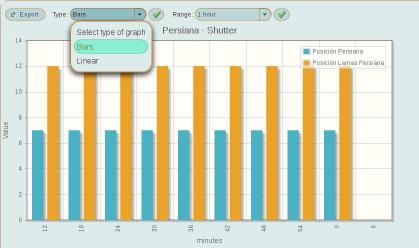
Graphs can be named and configured with different accountable values, in that case they will be shown in the Summary View with their corresponding thumbnail image that distinguishes between the two types of graphs: bar and lineal charts. As in the Panels View, the blank ones shown here are blank graphs with default blank background image and they aren't yet configured.
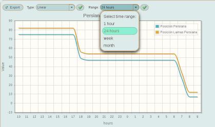
As you can see below, its possible to include several values in the same graph. In this example the graph is showing the values of the position of a Venetian blind with their slats for the last month (4 weeks) and for the last 24 hours. The values shown are the average values between hours or days, depending of the range being displayed.
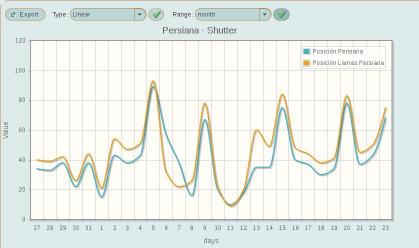

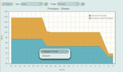
There is possible to change the format of the graph to show the total of aggregated values shown as an stack. To do so, right-click over the image of the graph and then select "Change Format" option from the contextual menu that appears over the graph.
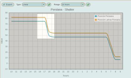
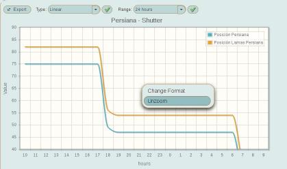
There is also possible to zoom the graph, by clicking left-button while selecting an area of the chart, and to unzoom through the chart's contextual menu.
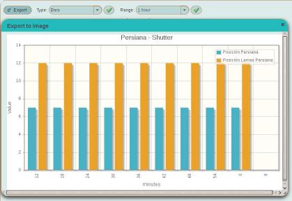
To end with the basic Graphs View, below you can see same graph in the bar chart format, also the result of the Export control that allows to obtain an snapshot of the image of the chart being shown.