Domorela's Blog: WUI Responsive Design
As said while introducing Web User Interface (WUI), users can browse Domorela's WUI using any W3C compatible browser (Firefox, Chrome, Safari Opera and others) without the need to install any app in the user's device.
So, to fit in any screen size, Domorela's WUI is designed using responsive design, also offering mobile design for certain views in devices with so little screen to fit well the desktop templates.
In the previous privacy article, it was explained that Domorela brings the maximum freedom to the customers and users and one of the ways to do that is to serve a WUI that can be browsed instead of requiring from the users to install any app in their devices.
The mentioned above demanded that the WUI can be fitted in any screen size while offering the proper appearance for each of the different devices accessing to the WUI. The way to do so is by using Responsive Design.
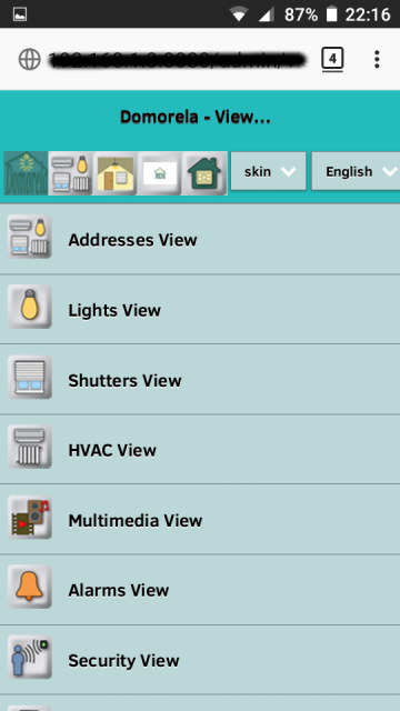
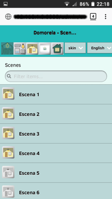
In order to show as observable certain views and/or menus in small screen sizes, without the need of zooming, Domorela's WUI is also using templates for mobile web pages.
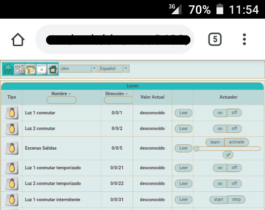
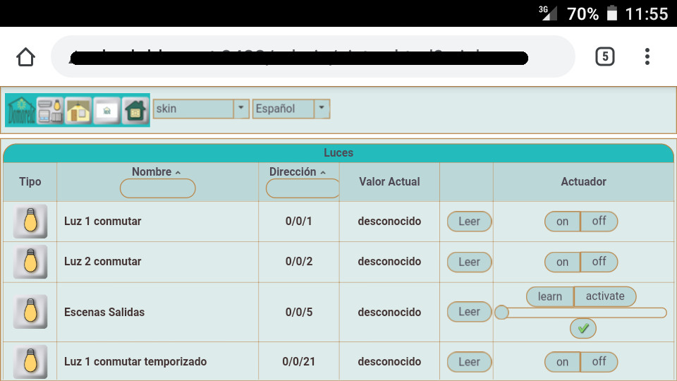
You can see below the responsive vertical and flat outputs of an adapted view from a common responsive template in a cell phone with 4.5" screen:
And below here they are the mobile design for Views Menu and Scenes View shown at the same 4.5" screen. Note there is no need to switch to flat, nor zooming the image, to read well the text: