Domorela's Blog: Basic features in Panels View
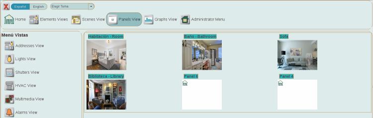
Domorela's User Interface also brings a Panels View. There is a predefined number of blank panels that can be configured by operator level users to bring the users different nice views of the controls attending to their location, or functionality, or any other criteria to be grouped together.
Panels can be named and configured with a background image previously uploaded, in that case they will be shown in the Summary View with their corresponding thumbnail image. The blank ones shown here are blank panels with default blank background image and they aren't yet configured.
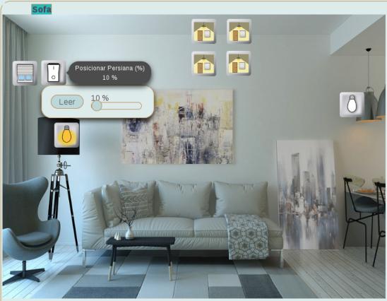
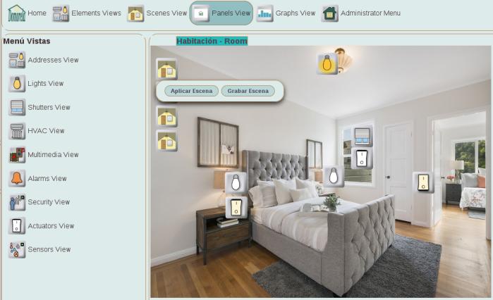
Below you can see a room example panel in which scene widgets, that allow save and apply scenes using the scene control, are aligned in the left top part of the panel while the rest of the widgets are located in the same place as the actual elements of the installation they depict: lights, shutter and their physical switches. Notice that the widget icons are showing their current state and will automatically change in the case this state is changed by the user viewing the panel, by any other user connected to Domorela or triggered by any physical control or event in the installation.
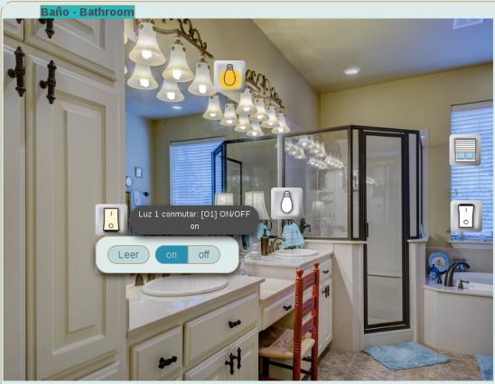
The images with panel detail below show two different types of the many controls present on the widgets: slider and on/off switch. Users can act over the widgets through their controls. To do so, left-click over the widget and the control is displayed.